16 February, 2015

Portrait Class

I was just now looking at my blog since who-knows-when and just now realized that I have more photos of paintings from my portrait class I never posted.

This first painting was done the third week.  I think this was one of my favorites.


The next week was this one...much softer and more blended. 


10 October, 2014

Landscape Painting with Charles Philip Brooks (Oct 4 and 5, 2014)


The art teacher I have been studying with (Melinda Borysevicz) took some time off for the summer.  This coincided with Paul and I spending almost all of our free time working on the house we bought.  Finally, the house is pretty much done, and we were able to move in.  Melinda invited artist Charles Philip Brooks in to teach a landscape class. 

In the morning, we headed out to Fort Pulaski, which is has large open areas of marsh.  I chose to do a "big sky" painting. 


I'm really pleased with how this turned out.
In the afternoon, we headed to the beach on Tybee Island to paint the ocean...


Painting a constantly-moving body of water is a real challenge, and the net result is a painting that depicts the essence of the thing, not the actual thing itself.  An awesome experience of really LOOKING at something and seeing that there is so much more to it than just a blue patch. 

I learned so much in this class, and really enjoyed it.  I have discovered that plein aire painting with oil paint is so much easier than the acrylics I was using before.  For these outings, I used my 9x12 Guerilla Painter box.  It's a nice rig, but heavy.  Fortunately, I was able to use my roller bag on most of the ground we had to cover.  The others in the class worked with French easels, and some of them had some issues with their equipment.  It seems like there is no such thing as perfect plein aire painting equipment.  I plan to continue to evaluate ways to lighten the load to make transport of the equipment less of a hassle.


29 May, 2014

Portrait Class, Weeks 4-6


For the last 3 classes, we worked on a single portrait.  This is the first weeks efforts, roughed in with just burnt sienna.


The second week, I more fully resolved the shadows with burnt sienna, and then worked on the varying tones in the light with gray tones.  Also worked on the hair.


The third and final week.  Got some real skin tone in there and more fully resolved details.  I don't consider it a "finished" painting.  There are some aspects of it that are still a little rough, but I think it came out pretty well overall.  Not too bad for a beginner, if I may say so myself.  For some reason, this final version looks much more colorful on my computer screen than it does in real life.


Portrait Class Week 3: 4/30/14


I decided to focus all my efforts on the painting this week, rather than trying to do a painting and a drawing.  No time to do much with the hair rather than just sketch in the shape of it, but my proportions are better. 

16 April, 2014

Portrait Class 4/15/14

My first portrait class.  I have drawn portraits before with charcoal, but this was my first time to paint a portrait.  First we warmed up with a drawing, practicing a loose blocking in of the facial features.


Then the exact same thing with the paint.  This is oil paint.


Considering it was just a 2.5 hour class and we had a demo in there and all, I'm quite pleased with both my drawing and painting.

03 April, 2014

Art Class 4/2/14


Color study in oil.  We had about an hour and 45 minutes to turn out a painting.  The goal was to do most of the mixing on the canvas, not on the palette.  The teacher is pushing lots of painting starts.  There isn't time to get hung up on fussy details.  I'm not crazy about how the lemon came out, but I think the sugar bowl came out pretty well.

27 March, 2014

Art Class 3/27/14

Spring classes started up again this week.  I have two weeks to attend before my new job starts on 4/7. 

Below is my very first oil painting.  White egg on a white sheet of drawing paper, put a spot light on it.  I got the oil paints a couple of years ago (right after we moved to Pennsylvania) and I finally decided to try them out.  Acrylics dry way too fast outdoors for plein air painting, so I figured I would give the oils a shot.  I really like the oil paint.  There are all kinds of things to mix into oil paint to make it do this or that.  This is just out of the tube.  It was such a joy to blend the paint to get the nice soft edges without the paint drying.

17 October, 2013

Art Class in Savannah

Working on a still life drawing.  It's really starting to look like something now.


05 October, 2013

Nancy Barch Workshop Aug 19-21, 2013

So, before leaving Delaware, I squeaked in one more 3-day workshop with Nancy Barch.  I find it interesting to note that from workshop to workshop, my approach and thought processes have changed from the first workshop I took with Nancy.  I am trying to become more process oriented and less concerned about outcomes.

My favorites from the workshop were built on top of older unfinished paintings.


07 July, 2013

Pat Dews Workshop June 10-14

For the longest time, I have been a huge fan of Pat Dews.  Way back when I first started painting, I got of one of her books, and she quickly became one of my first art "heroes".  Pat works in mixed media.  Watercolor, ink, acrylics and collage.  The supply list for this class was 2 pages long.  We worked full sheet for all paintings (22"x30"), so even the paper took up a lot of space.  Here is a photo of all the art supplies I took with me for the trip.
The following are photos of work in progress and painting "starts".  We started a lot of paintings.  I didn't finish most of them.  This first one was created with acrylic inks.
This next painting below is what Pat calls an "altered surface".  It was started from a failed painting I had kicking around from about 7 years ago.  Previously, I would have chopped the painting up and made cards out of it.  Pat showed us new ways to salvage lousy paintings and turn them into something new and interesting.  The original painting shows through most readily in the grey patches.  The original was bright orange and turquoise.  I washed over it with some grey to tone it down a little before laying out a new design on top of it.  It is interesting that a painting is more visually interesting and complex when it has some kind of under-painting, even if very little of it is obvious at the end.  This is the magic of the "altered surface" (building a painting on top of an old one) rather than using a new sheet of paper. This one is well on its way, but still needs some work.
 Painting below created with acrylic ink.  There are things about it I really like, but it's not finished.  Part of me likes the off balanced look of it, but hmmm...it really needs to have colors worked through from left to right and that big open space on the lower left really shouldn't stay that way.
This painting start was done with acrylics, and white spaces preserved by laying down collage pieces, which were painted over, and then removed.
Below is the finished painting from the painting start above.  Inspired by one of the photos Pat brought with her, taken at a shipyard.

Here we all are at the end of a very busy week.  Some amazing talent in this room!  Most of the students were fairly local.  Two ladies traveled all the way from Canada for this class.  Pat is right there, front and center in the bright pink (paint covered) shirt.  She is a fantastic teacher, and I highly recommend her workshops!

30 May, 2013

Watercolor with Experimental Mixed Media

For the spring term, I took a class at the Chester County Art Association in Watercolor with Experimental Mixed Media with Chris Chadwick.  It was my intention to just go to the class, try out whatever he had in mind for us to do with no expectations of producing any artwork worth keeping.  We used cheap watercolor paper, and a huge variety of other things to just experiment.  For the most part, the paintings I did in class were nothing to write home about.  However, a few paintings I like came out of it. 

This first painting is watercolor with rice paper collage.


The paintings below were all done the last 2 weeks of class.  In the second to the last class, he showed us how to do batik with paper, and we all enjoyed it so much that we unanimously voted to do batik in the last class also (he let us choose what we would do in the last class).  I like the batik so much that I would eventually like to get the supplies to be able to do it at home.  These are all watercolor with the batik.   


05 May, 2013

New Work


These paintings all utilize India ink.  The washes are done with acrylic ink, although it looks a lot like watercolor.


05 April, 2013

Nancy Barch Workshop: April 2013

Another fantastic workshop with Nancy Barch!  It was a 5-day workshop with a 3-day option (attend any 3 days).  Due to the schedule at work, 3 days was all I could get off from work.  These pictures were all "posed" with mat corners to show potential ways of cropping them.  The last one really is not quite finished yet.  I ran out of time and energy.  Overall, I'm really pleased with what I was able to accomplish in the 3 days.


02 December, 2012

Nancy Barch Workshop


I took a workshop with artist Nancy Barch last month.  I still have a hard time reconciling my interests in so many different directions of art simultaneously.  I suppose by my recent photos, it may have appeared that I wasn't enjoying this type of art anymore...well, I do.   I enjoy the other as well.

These pieces are just laid out with these mats for the purpose of the photo.  I have not made final crops on them, and eventually, I may crop them differently or have custom mats cut for them.

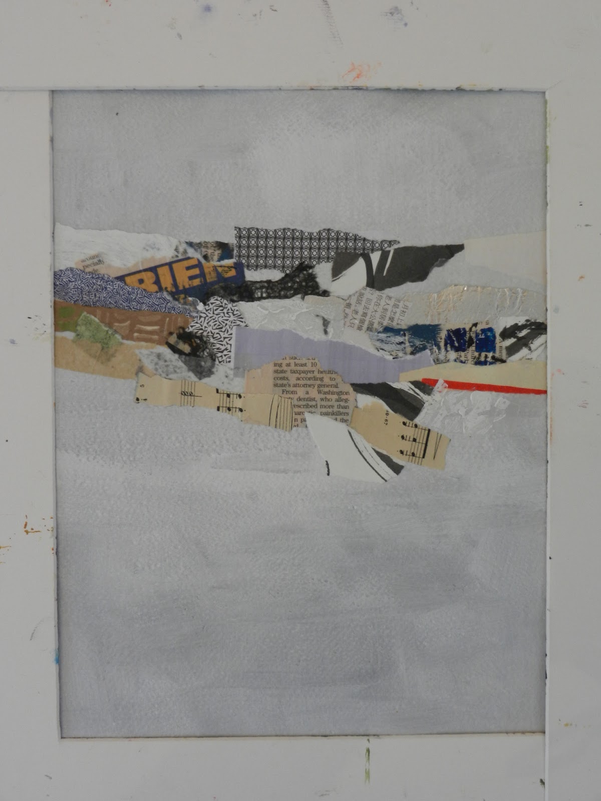
This green painting combines acrylic paint, image transfer (of some doodles from my sketchbook), collage, stamping and drawing.  It is a half sheet of watercolor paper, so is quite a bit bigger than this mat.  I don't know if I will mat it down to this small of a size (it's a 16x20" mat) or have a mat custom cut for it.  I like this composition, though.

 
This blue painting involves acrylic paint and collage. Like the green painting above, it was originally done on a half sheet, so I don't quite know how I want to crop it as a finished piece, but this pleases me pretty well as it is now.
This piece is Asian-inspired.  There is lots of 3-dimensional texture that may not be apparent in the photo.  It is on a quarter sheet of paper, and matted to 16x20".   It combines acrylic paint, acrylic gel medium texture, and collage.
The following two images come from a single painting on a quarter sheet.  There is a lot of collage in there and the color is provided by acrylic inks.  There are numerous ways that this piece could be cut up, and I haven't decided how to crop it yet.  Both of these are possibilities.

Needless to say, it was an extremely fun workshop, and I hope to be able to take more classes and workshops with Nancy in the future!

29 November, 2012

New Drawing

It has been a while since I posted any of the drawings from my art class.  This is the drawing I started on Week 4.  I continued working on it in Week 5.  At that point, it still needed some work, but I needed to take a break from this.  Over the next few weeks, I started several drawings, but finished none of them.  Last night was our last class, so I took all my half-finished drawings with me and decided to try and get one or more of them wrapped up.  Finally, I am declaring this one finished.  Image size is approx. 14" by 17", charcoal on Raffine heavy sketch paper.

05 October, 2012

Drawing and Painting: Composition


Our topic this week was COMPOSITION.  We learned about structural composition and placement.  I worked from a reference photo and chose to do an unconventional cropping of the image to create a more dynamic composition.  The teacher gave it the "thumbs up", so I came home feeling much more pleased than I did a couple of weeks ago.  (We did not have class last week, so that is where the lost week went.)

I am working on a smoother paper than I worked on with the Still Life class last spring.  The dimples in paper made for working with charcoal kinda bug me...in particular, the texture of Strathmore charcoal paper.  I don't like it much.  This is a heavy weight sketch paper by Raffine, it's got a nice tooth to it.  I am really loving the charcoal and plan to continue with it.  I guess one thing I love about it is all the nice variation in tone that can be achieved by working the surface (I tend to use my fingers).  I enjoy getting my fingers in there and blend and smooth the color out.

04 July, 2012

Landscape Painting in the Brandywine Area

To celebrate  my 50th birthday...yes, I'm that old now...I treated myself to a 5-day plein air painting workshop with David Dunlop.  He is an art instructor from the Silvermine Art Guild in New Canaan, CT.  I met him at a workshop he taught at Art of the Carolinas down in Raleigh last November.  His website is here if you want to read more about him:   http://paintingclass.net/index.html

If you check out his website, be sure and take a peek at his blog...there is a link on his web page.  What makes painting with him such an enriching experience is that he goes beyond just telling you what to do.  He can explain why things work, including design elements, how the human eye perceives things, and a lot of science as to why things look the way they do.  He also gives lots of tips for portraying things in a painting to trick the viewer into believing there is more going on than there really is.  There is as much science involved as there is "art", if not more.  I can't begin to describe how much I learned.

The days were long.  Besides painting time, we went on photo walks, watched his demos, 3 dinners, critiques, the light show at Longwood Gardens, etc.  We generally got started at 9:30 am each day, and 3 out of the 5 days, it was 11 pm before I was able to get to bed.   Then I was up early each day to reload my gear (preparing more paper, panels, brushes washed and repacked, fresh water in my bucket, etc.).  In spite of taking a break from my normal diet and exercise routine, I still managed to lose 2 pounds over the course of the week.

I took tons of photos on my poor old Kodak Easy Share camera...in spite of its limitations, it still takes some decent photos.  This was the maiden voyage of my Guerilla Painter kit (9 x 12 inch pochade box, tripod and rolling bag to carry it all).  For the most part, I was happy with the equipment.  However, I learned that if rolling the bag is not an option, the smartest thing is to remove the tripod from the bag before attempting to carry it like a backpack, and to carry the tripod separately.  For me, the tripod made it too heavy for my back.  All packed up in the bag though, with a small Coleman camp stool (which also fit in the bag), the only additional things I took with me went in my regular backpack (sketchbook and pencils, pouch with my brushes in it, camera, wallet, etc.)  The more I paint, the more I realize that the less I need to take with me.  This is a link to Jerry's Artarama's page with the Guerilla Painter things...

http://www.jerrysartarama.com/discount-art-supplies/easels/travel-and-outdoor-easels/guerrilla-painter-easel-systems/9x12-guerrilla-painter-box.htm

I wore an insect-repellant sunhat, which seemed to keep the bugs away from me (I didn't use any additional repellant other than the hat).  I guess it was sheer dumb luck that kept me from having problems with poison ivy, because apparently it was growing everywhere we went, and I didn't even know what it looked like (I do now).

For now, I'm just posting the paintings I did...perhaps will post some of the photos I took at a later date.  I must add this disclaimer...as part of the instruction involved, David painted on all of these...some more than others.  So, these are collaborative efforts, not my original works of art.  These are presented in the order in which they were painted.  Oh, and for those people that think you need a lot of stuff to paint...with the exception of the last painting depicted, I did all these paintings using only 4 colors:  hansa yellow medium, quinacridone magenta, ultramarine blue, and white.  Everything you see was mixed from these 4 colors.  I also found that Golden Acrylic Glazing Medium is great stuff.  It really came in handy.

This one done on the first day, at Brandywine Creek State Park, near the Adams Dam Road entrance.  I was under a bridge for this one.  7.5 x 11 inches, acrylic on hot pressed watercolor paper (half of a quarter sheet, if you are wondering about the odd size).


Second day we were off to Longwood Gardens.  Not too far from the entrance is a long avenue of flowers, all arranged by color in rainbow format.  I fell in love with these orange flowers, and fortunately, there was a nice big shade tree nearby to paint under.  7.5 x 11 inches, acrylic on hot pressed watercolor paper


To give them a little extra pop, I worked them a bit more pink in this painting, to give complement to the green in the background.  The leaves on these plants are also gorgeous, kind of deep red and green.


I didn't paint on Thursday, because by the time we got through everything else we were doing, it was already 3:30 when we had time to paint...I was feeling rushed, so decided against painting.  This was the day we were at the Brandywine museum (home to a large collection of Wyeth family art), so I went back to the museum to look at the art some more after David's demo, a painting of a side-lit path, much like the one I decided to portray below...

Back to Brandywine Creek State Park for Friday.  This time, we were over by the Thompson Bridge Road entrance.  By this time, Mother Nature was letting us know it was summer.  As the day wore on, it got really quite hot out.  This first painting is acrylic on a 12 x 16 Pintura Canvas Panel.  This particular painting was a real lesson in dealing with light coming through spaces on the right side and how to portray this, painting foliage, dealing with atmosphere in the horizon, etc. 


This next painting, back on the hot pressed paper...more variety of foliage, lesson on portraying water, both in light and shade, reflections, etc.


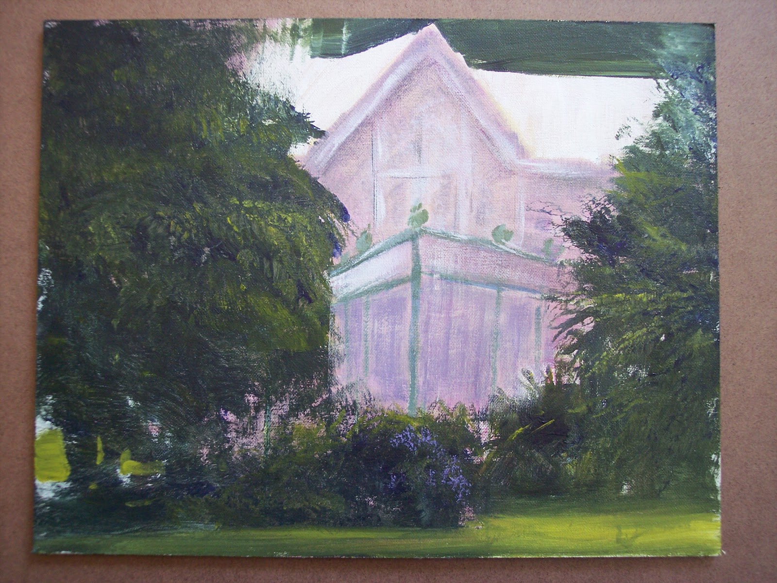
Saturday, the last day, we were at Rockwood Museum and Park.  It was hot and the sun was moving quickly.  I had to move several times in the process of completing this painting, trying to stay in the shade.  I really liked the way this house and the greenhouse structure peeked out of the foliage.  Acrylic on 11 x 14 Pintura Canvas Panel.


Last but not least...a somewhat abstract painting, painted more by David than by me...a lesson in light and shadow using transparent colors against the yellow background.  I think I overworked the red flowers. Acrylic on  9 x 12 Ampersand Artists Panel.