
29 November, 2012
New Drawing

05 October, 2012
Drawing and Painting: Composition

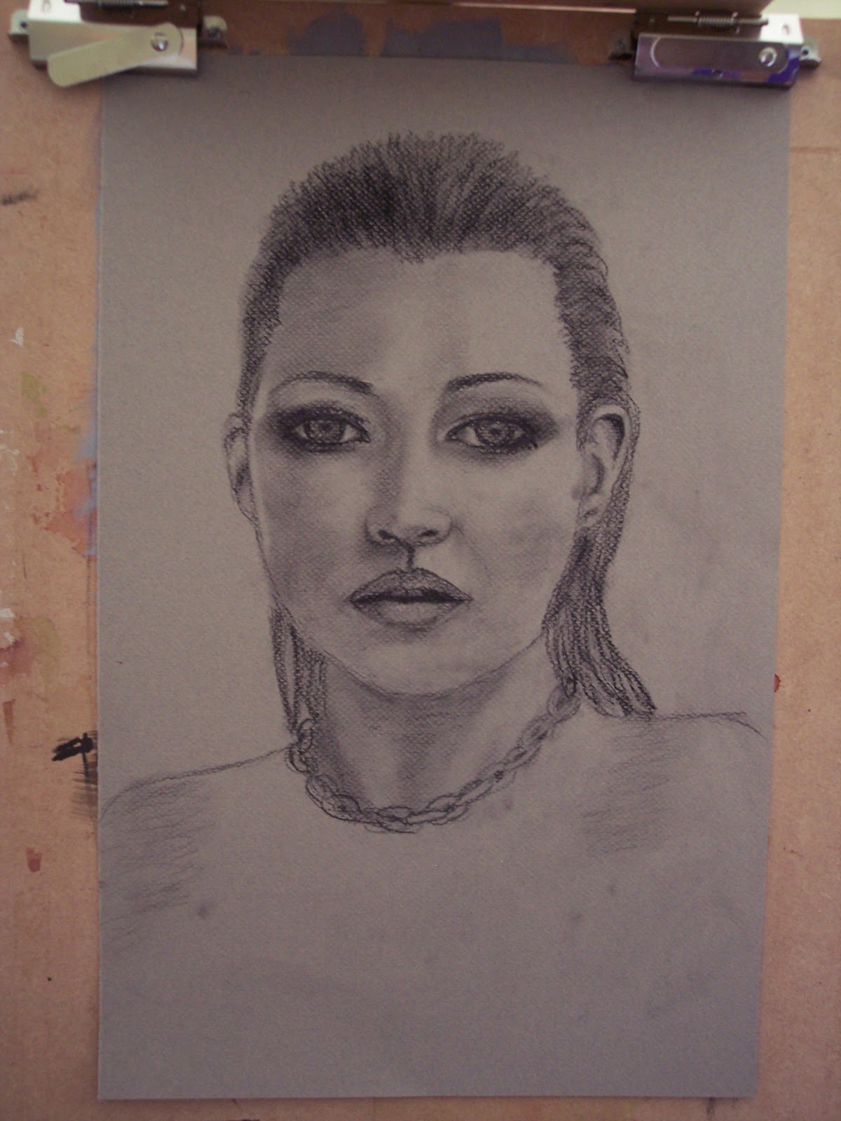
Our topic this week was COMPOSITION. We learned about structural composition and placement. I worked from a reference photo and chose to do an unconventional cropping of the image to create a more dynamic composition. The teacher gave it the "thumbs up", so I came home feeling much more pleased than I did a couple of weeks ago. (We did not have class last week, so that is where the lost week went.)
I am working on a smoother paper than I worked on with the Still Life class last spring. The dimples in paper made for working with charcoal kinda bug me...in particular, the texture of Strathmore charcoal paper. I don't like it much. This is a heavy weight sketch paper by Raffine, it's got a nice tooth to it. I am really loving the charcoal and plan to continue with it. I guess one thing I love about it is all the nice variation in tone that can be achieved by working the surface (I tend to use my fingers). I enjoy getting my fingers in there and blend and smooth the color out.
04 July, 2012
Landscape Painting in the Brandywine Area
If you check out his website, be sure and take a peek at his blog...there is a link on his web page. What makes painting with him such an enriching experience is that he goes beyond just telling you what to do. He can explain why things work, including design elements, how the human eye perceives things, and a lot of science as to why things look the way they do. He also gives lots of tips for portraying things in a painting to trick the viewer into believing there is more going on than there really is. There is as much science involved as there is "art", if not more. I can't begin to describe how much I learned.
The days were long. Besides painting time, we went on photo walks, watched his demos, 3 dinners, critiques, the light show at Longwood Gardens, etc. We generally got started at 9:30 am each day, and 3 out of the 5 days, it was 11 pm before I was able to get to bed. Then I was up early each day to reload my gear (preparing more paper, panels, brushes washed and repacked, fresh water in my bucket, etc.). In spite of taking a break from my normal diet and exercise routine, I still managed to lose 2 pounds over the course of the week.
I took tons of photos on my poor old Kodak Easy Share camera...in spite of its limitations, it still takes some decent photos. This was the maiden voyage of my Guerilla Painter kit (9 x 12 inch pochade box, tripod and rolling bag to carry it all). For the most part, I was happy with the equipment. However, I learned that if rolling the bag is not an option, the smartest thing is to remove the tripod from the bag before attempting to carry it like a backpack, and to carry the tripod separately. For me, the tripod made it too heavy for my back. All packed up in the bag though, with a small Coleman camp stool (which also fit in the bag), the only additional things I took with me went in my regular backpack (sketchbook and pencils, pouch with my brushes in it, camera, wallet, etc.) The more I paint, the more I realize that the less I need to take with me. This is a link to Jerry's Artarama's page with the Guerilla Painter things...
http://www.jerrysartarama.com/discount-art-supplies/easels/travel-and-outdoor-easels/guerrilla-painter-easel-systems/9x12-guerrilla-painter-box.htm
I wore an insect-repellant sunhat, which seemed to keep the bugs away from me (I didn't use any additional repellant other than the hat). I guess it was sheer dumb luck that kept me from having problems with poison ivy, because apparently it was growing everywhere we went, and I didn't even know what it looked like (I do now).
For now, I'm just posting the paintings I did...perhaps will post some of the photos I took at a later date. I must add this disclaimer...as part of the instruction involved, David painted on all of these...some more than others. So, these are collaborative efforts, not my original works of art. These are presented in the order in which they were painted. Oh, and for those people that think you need a lot of stuff to paint...with the exception of the last painting depicted, I did all these paintings using only 4 colors: hansa yellow medium, quinacridone magenta, ultramarine blue, and white. Everything you see was mixed from these 4 colors. I also found that Golden Acrylic Glazing Medium is great stuff. It really came in handy.
This one done on the first day, at Brandywine Creek State Park, near the Adams Dam Road entrance. I was under a bridge for this one. 7.5 x 11 inches, acrylic on hot pressed watercolor paper (half of a quarter sheet, if you are wondering about the odd size).

Second day we were off to Longwood Gardens. Not too far from the entrance is a long avenue of flowers, all arranged by color in rainbow format. I fell in love with these orange flowers, and fortunately, there was a nice big shade tree nearby to paint under. 7.5 x 11 inches, acrylic on hot pressed watercolor paper

To give them a little extra pop, I worked them a bit more pink in this painting, to give complement to the green in the background. The leaves on these plants are also gorgeous, kind of deep red and green.

I didn't paint on Thursday, because by the time we got through everything else we were doing, it was already 3:30 when we had time to paint...I was feeling rushed, so decided against painting. This was the day we were at the Brandywine museum (home to a large collection of Wyeth family art), so I went back to the museum to look at the art some more after David's demo, a painting of a side-lit path, much like the one I decided to portray below...
Back to Brandywine Creek State Park for Friday. This time, we were over by the Thompson Bridge Road entrance. By this time, Mother Nature was letting us know it was summer. As the day wore on, it got really quite hot out. This first painting is acrylic on a 12 x 16 Pintura Canvas Panel. This particular painting was a real lesson in dealing with light coming through spaces on the right side and how to portray this, painting foliage, dealing with atmosphere in the horizon, etc.

This next painting, back on the hot pressed paper...more variety of foliage, lesson on portraying water, both in light and shade, reflections, etc.

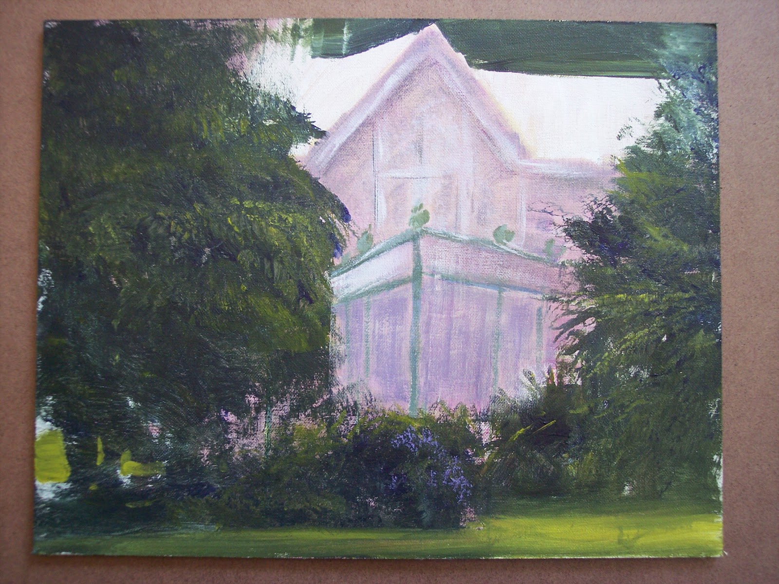
Saturday, the last day, we were at Rockwood Museum and Park. It was hot and the sun was moving quickly. I had to move several times in the process of completing this painting, trying to stay in the shade. I really liked the way this house and the greenhouse structure peeked out of the foliage. Acrylic on 11 x 14 Pintura Canvas Panel.

31 May, 2012
Portrait Update
15 April, 2012
New Collages
I had fun with these last week. By the time I was done, my hands were as covered as the paper. I have them"posed" for the photo with a white mat...I think they would look great with a black mat, but I don't feel like digging through boxes to find one, so the white mat will have to suffice for now.
The Bitch is Back:

My Confession:

The Bitch is Back:

My Confession:

26 February, 2012
Conceptual Collage
I am still working from the book Art from Intuition by Dean Nimmer. One of the exercises was to do 10 small collages from which one might choose to develop into a painting.
These are the first two.
 After this, I fell back to cut paper collage, using primarily magazine paper. I love working with magazine paper. With these, I was working on developing lines that continue onto other pieces.


 If you are actually counting, there are only 8 of them, not 10. Still working on the last two. Regardless of how random these may look, this is actually a fairly time consuming process...looking for shapes and colors that work together. It's almost like doing a puzzle. I have been working on these a few minutes at a time, like maybe 20 minutes in the morning while drinking my coffee.
These are the first two.
 After this, I fell back to cut paper collage, using primarily magazine paper. I love working with magazine paper. With these, I was working on developing lines that continue onto other pieces.

 If you are actually counting, there are only 8 of them, not 10. Still working on the last two. Regardless of how random these may look, this is actually a fairly time consuming process...looking for shapes and colors that work together. It's almost like doing a puzzle. I have been working on these a few minutes at a time, like maybe 20 minutes in the morning while drinking my coffee.
10 January, 2012
Watercolor with Sumi and Hake Brushes
 Thank you to Traci Bautista for this week's video lesson. The "aha!" moment for me was when she pulled out her sumi brush. I had sort of "forgotten" or been distracted from my eastern brushes lately. This is just a quick playful watercolor painting I did this morning, and it gave me such joy to do it.
02 December, 2011
New Paintings


Since my class with Doree Loschiavo a couple of months ago, I am still totally hooked on playing with watercolors and water soluble crayons. I've continued doing these types of paintings...these are 2 of my recent favorites.
31 October, 2011
Experiment and Create Workshop
On Friday 10/28, I attended a workshop at the Community Arts Center in Wallingford, PA. The instructor was a very nice lady named Doree Losciavo. At first, she just kind of painted and we watched her, and then she told us to start...just start.
Lately, I like to use reference photos, not because I'm trying to copy the photos literally, but just to get ideas of colors and relationships of objects to each other. The photo is just inspiration to get started. This helps me get past the "what to paint?" The finished product looks very little like the photo.
These are the 3 pieces I finished in the class. Not the best photos, but they suffice, I think. The first 2 are watercolor, water soluble crayon and collage. The third, just watercolor and water soluble crayon. This is the first time in years I have collaged into a painting. I think it's important, if collage is added, that it be integrated into the surface and not appear as a crafty looking add-on.


 This last piece is shown with a mat that is really too small for it. It's a 12x16" mat, which cuts off too much of the picture, but the 16x20" mat was too big. I just used the small mat for the photo, but would like to get one that fits it better.
Lately, I like to use reference photos, not because I'm trying to copy the photos literally, but just to get ideas of colors and relationships of objects to each other. The photo is just inspiration to get started. This helps me get past the "what to paint?" The finished product looks very little like the photo.
These are the 3 pieces I finished in the class. Not the best photos, but they suffice, I think. The first 2 are watercolor, water soluble crayon and collage. The third, just watercolor and water soluble crayon. This is the first time in years I have collaged into a painting. I think it's important, if collage is added, that it be integrated into the surface and not appear as a crafty looking add-on.


 This last piece is shown with a mat that is really too small for it. It's a 12x16" mat, which cuts off too much of the picture, but the 16x20" mat was too big. I just used the small mat for the photo, but would like to get one that fits it better.
01 March, 2011
Painting on Unprimed (Raw) Canvas

This is what I painted in painting class last week. The instructor provided us with some raw canvas to paint on, as inspired by the famous painter Helen Frankenthaler. Thin watery paint bleeds into the canvas while thicker applications remain on the surface. At one point she asked me what it was that I was painting, and my response was "some kind of sunset thing". I actually turned it upside down to add darker colors to the "ground", and when flipped upright, the canyon kind of miraculously appeared. Since the canvas is unstretched, I could have it stretched onto some stretcher bars, but I think I will likely do is get the old sewing machine out at some point and make a wall hanging out of it. Really happy with this painting.
Subscribe to:
Posts (Atom)